Logspot

logspot(非常好用)

Logspot is an open source change log template made with Nuxt, Vue, and Tailwindcss. Subscribe to our newsletter to get the latest updates or follow us on twitter. 这里我们是可以自定义的//oh😯

v 1.03

First post in the changelog

Thrilled to announce the launch of logspot!

logspot-banner

Logspot is a lightweight, free and open source template for your changelog made with Vue, Nuxt and Tailwindcss. It leverages Nuxt Content for your feed which allows you to write markdown and use them as a CMS. It has a beautiful UI and is easy to use.

Features

  • Dark mode
  • Markdown support
  • RSS feed
  • Search
  • Themeable
  • Document driven mode
  • Access to over 100,000 icons with Iconify
  • Code highlighting with Prism
  • Completely static
  • Use your own logo
  • Use your own favicon
  • Frontmatter support (Dates, Authors and other metadata)
v 1.02

Code Block Syntax highlighting

Logspot also supports code syntax highlighting as well

codeblocks

// Javascriptconst url = "https://jsonplaceholder.typicode.com/posts/";async function fetchPosts() {  const response = await fetch(url);  console.log(response);}

Currently this is only supported for the following languages, to keep the bundle small for this demo.

  • JavaScript
  • CSS
  • HTML
  • Markdown
  • TypeScript
  • Vue
  • Python
  • Ruby

You can always add your own languages to the highlight array in the nuxt.config.js file.

Support for inline code blocks is also available example const name = "John Doe"

Shiki also supports different themes for codeblocks, you can learn mode about them here

v 1.00

Built in UI Components

This template also supports a few ui components that I have designed, which you can directly use within markdown.

The Icon component

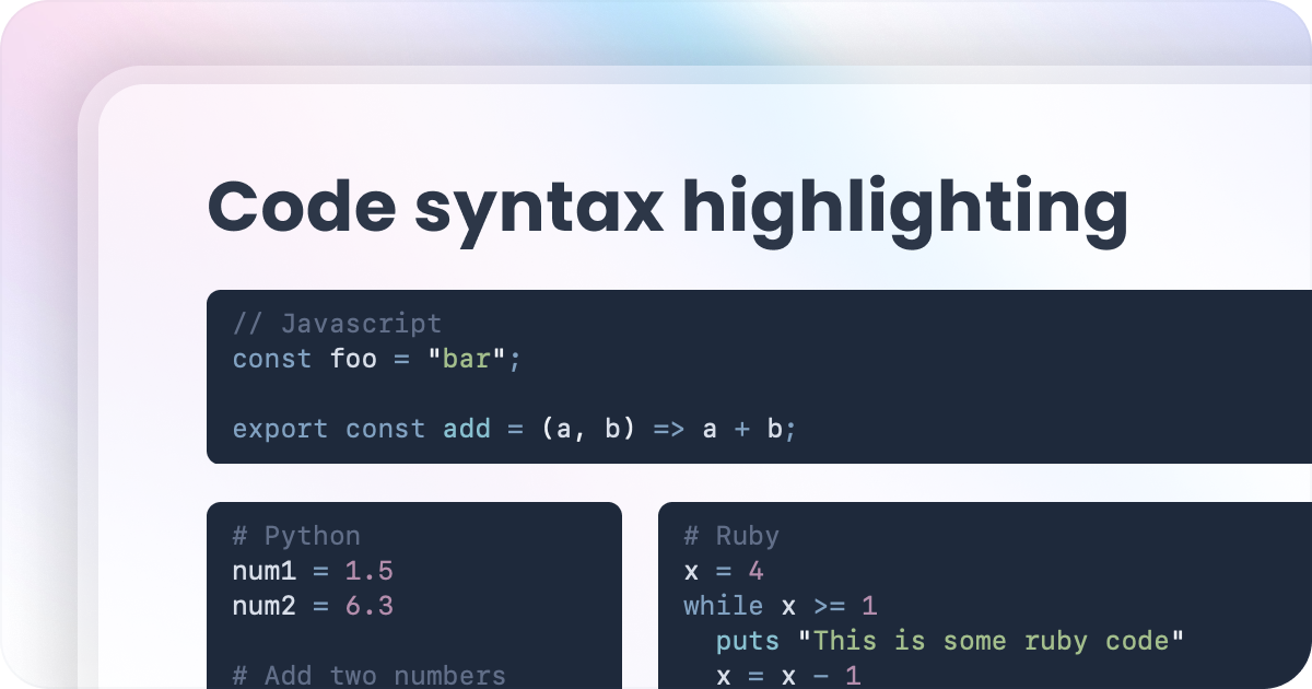
Internally it uses the Iconify icons library. You can copy the icon key and just pass it as a prop like this :icon{name="ph:user-circle-duotone"}, which results in rendering the icon

Examples

  • Fluent Icons
  • Hero Icons Solid
  • Google Material Icons

The Alert component

You can also an alert component, which accepts an icon, title and description.

The alert component accepts three props, the icon(optional, defaults to the exclaimation icon), title and description.

::alert---icon: fluent:error-circle-24-regulartitle: This is alert with default variant colors.description: This will pick up colors from your primary color set in the tailwind config file. You can use this to show some kind of message to your users.---::

This is alert with default variant colors.

This will pick up colors from your primary color set in the tailwind config file. You can use this to show some kind of message to your users.

This is a simple alert with variant set as `success`.

A simple green colored alert, with a different icon.

This is an alert with variant set to `danger`.

Something aweful has happened

v 1.0.4

Widgets - Floating and overlay

widgets

Logspot provides a built in widget page, which is responsive, lightweight, minimal and easily customizable. Embed it in your website, blog, or any other website, using it as an iframe. Here is an example page which has both the floating and overlay widgets.

v 5.0.1

一个支持K8S和欧拉的完美版本

新功能

  • 口水
  • 大大
  • 大萨达大所大所大所多撒大所

BugFix

  • 扣扣扣扣
  • 大叔大婶大所大所大所大所